Friday, 6 February 2015

Urban Decay Vice 3 Palette - The New Love Of My Life

So for Christmas I got surprised with this absolute darling. And I'n being hyperbolic when I say surprised. When people were asking me what I wanted for Christmas, I would say general things, but in my heart of hearts I wanted this palette, but I knew it was too expensive to ask for. Then my brother and - I imagine more so - my sister in law, bloody well bought it for me. I was ecstatic, cos look at this thing. LOOK AT IT. Also, the Vice 2 Palette was one of my favourite things, so having another box of jewels disguising themselves as eye shadows is great.

The outer packaging is beautiful, as per usual for Urban Decay. Also the colour scheme is just gorgeous. I sort of want bed sheets that look like this.
 The palette comes in this fetching case, which I haven't yet used for anything else, but I really want to.
 The case is a metallic version of the outer packaging. It's sturdy, but suffers from fingerprints, as you can see.
 Much like the Vice 2 Palette, Vice 3 has a large mirror on a proper hinge, so it actually stays up and doesn't unbalance the whole palette (I'm looking at you Naked 3). Also, the bottom of the palette is a metallic green and it looks so good. Oh, and a make up brush, which I'm fairly sure is the same one as the Vice 2 brush. Synthetic, pleasant to use, not going to replace any of my typical brushes.
And here is my pretty box of jewels. Just pause a while and marvel. Take in alllllll the pretty. The palette has a great mix of colours, with various tones of neutral, matte and shimmery colours, dark shimmery colours and bright shimmery colours. You don't need any other colours to create a full look, there are blending shades, highlight shades, darker shades and those bright pops of colour which are the real fun.
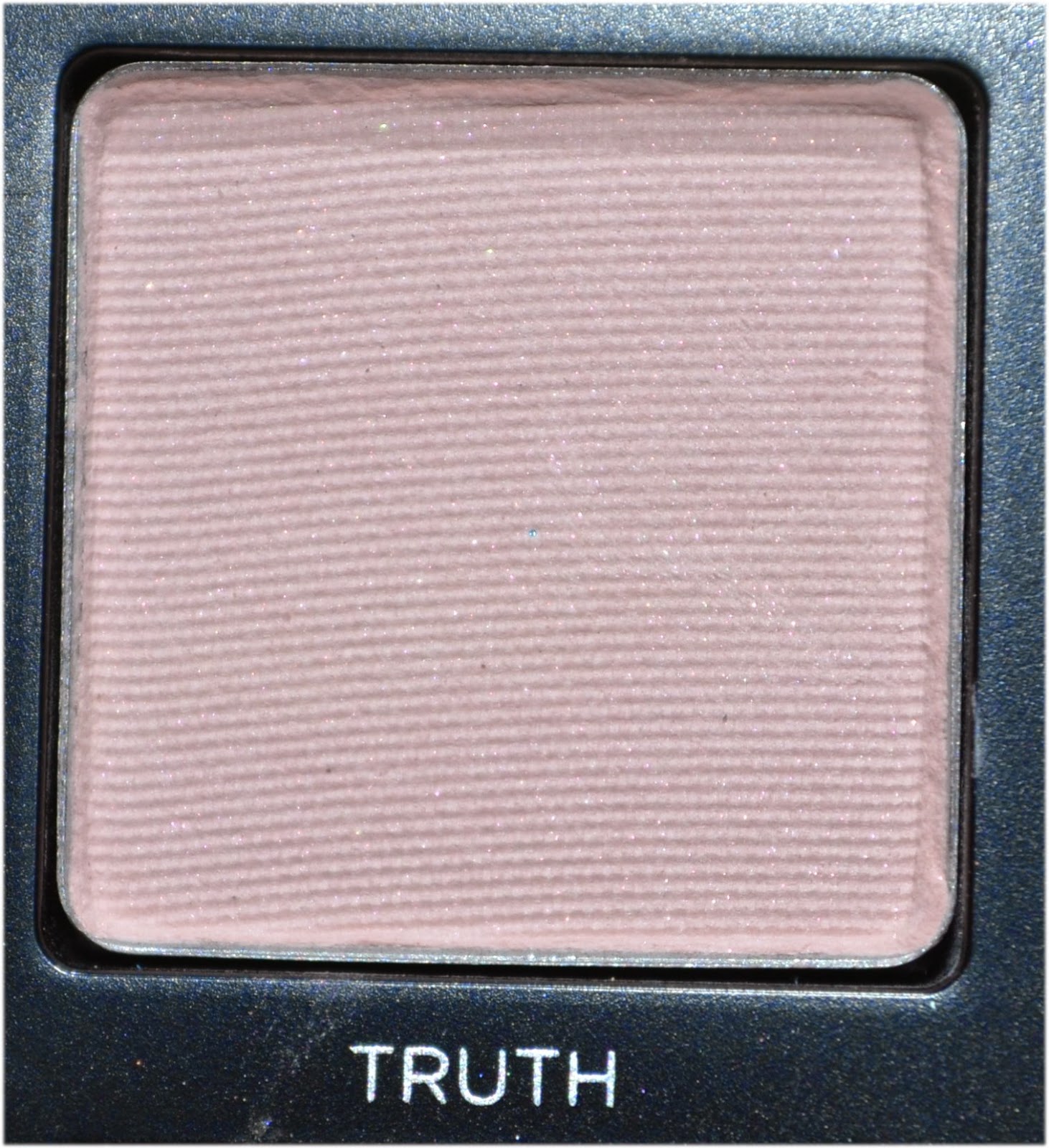
Truth is a pretty, pink toned neutral. It can work as a highlight, and also that close-to-skin-tone shade that you use to correct your mistakes.
It's a little chalky, so I would recommend layering it over a white eye liner if you really want it to pop.
 Undone is slightly darker than Truth and has a subtle silver glitter running through it. This is a great transition colour, especially for a lighter skin tone.
The glitter doesn't show up a huge deal, so this functions as a matte more than anything.
 Downfall is the perfect warm, brown, blending shade. I tend to start with this colour in the crease and then working from there.
 It goes on like butter, all of the shades do.
 DTF, like Undone, has a subtle glitter running through it. It's a lovely dark, matte brown.
I tend to use this shade to darken the crease. Again, the glitter doesn't show up too much.
 Dragon is one of those 'pop of colour' shades, and its great.
 It's real shimmery and pigmented and wonderful.
 Freeze is a more individual shade to me, I don't think I own anything quite like it, which is exactly what I want in an eye shadow.
Again, really shimmery and pigmented.
 Heroine is the kind of shade I always get drawn to. There's something about dark blues with glitter embedded in them that draws me in.
 This is the kind of shade I would always use with a sticky eye pencil, even though I haven't used one here (I just used Two Faced Shadow Insurance). The glitter isn't hugely prominent on the eyes.
 Brokedown is a great shimmery medium shade. It's perfect on the lid if you want something classy and more subtle.
Very nice and shimmery.
 Vanity is a gorgeous shade, but I often tend to stay away from purples, I can't really tell you why. Nonetheless, it's a lovely toned down purple.
 This colour looks great on the outer third of the lid paired with a peachy shade.
 Lucky is one of my favourite shades in this palette. It's a warm gold and evokes ideas of Egyptian-esque make up.
IT JUST LOOKS SO GOOD. Again, great as a subtler lid shade.
 Reign is a cold, darker, shimmery brown. It's one I haven't used a great deal and I want to experiment with it more.
It's beautifully pigmented, and would work well as an outer third of the lid shade.
 Bobby Dazzle is a shimmery, shimmery white.
This shade is a great highlight. I consistently use it in the inner corner as it just ties a look together.
 Alien is another shade I wouldn't typically use, but it is very pretty.
 It's a pale, shimmery pink, with a warmer sparkle. This will look gorgeous as a lid shade.
 Alchemy is another favourite of mine, cos duo-chromes are my jam.
It is a pink with a blue duo-chrome and looks like perfection on the lid.
 Bondage is a great colour to have, as a dark, shimmery, grape shade can create a really pretty smoky eye.
 This shade is great as a lid colour with a more defined crease, or a smoky eye. It's really sexy.
 Sonic is my darling of this palette. It is such an individual shade and looks AMAZING on the lid.
It is a warm, reddy bronze with a great shimmer. It's so great.
 Last Sin is a beautiful pale taupe shade.
 It's great in the inner third of the lid and possibly the inner corner.
 Angel is a darker, colder Last Sin.
This is wonderful as a lid shade if you want something a little colder.
 Defy is a lovely cold dark shade with a glitter running through it. It's perfect as a crease darkening shade.
 The glitter hardly comes across, so this works as a matte. Very useful shade.
 Revolver is a dark, dark blue with a whole lot of shimmer.
This shade looks great on the lower lash line and will look beautiful in a smoky eye.

All of the swatches are used over Two Faced Shadow Insurance, but I would recommend using a creamy eye pencil to get the best out of all the colours. They all blend nicely, but they all have LOADS of fallout, so just do your foundation after your eyes and have make up wipes to hand. It's the price to pay for buttery eye shadow.

I've been having a great deal of fun with this palette, and I would heartily recommend it if it's within your budget, because I believe it to be worth it. You get 20 great eye shadows that are all well pigmented, an amazing range of colours (from neutrals to brights and shimmers to mattes) and the palette itself is sleek, sturdy and well designed. It's just bloody great.


Friday, 16 January 2015

Women Of Shakespeare: Desdemona - 'The Handkerchief!'

The next look in my utterly self indulgent series is for Desdemona, the unfortunate wife of Othello. Othello is sort of a quintessential tragic hero (although I know my lecturer would heartily disagree with that statement, he seems to hate the very concept of the tragic hero and his fatal flaw, and I get it, but this isn't an essay soooooo). Othello appears to be the only black man in Venice and is married to a very white woman (but still Italian, but would have been acted by a white man, so make of that what you will). Desdemona and Othello are happy and in love, but Othello is overcome with jealousy, relating to an incident with a handkerchief, and ends up suffocating Desdemona just before he finds out she's been completely faithful. Heart wrenching stuff.

My inspiration for this look came from the description of the handkerchief, which was said to be white with embroidered strawberries on it. Also I went pale skin, as Desdemona is supposed to be real white in comparison to her husband.

 For the skin I mixed Stargazers White Foundation with my typical foundation (currently Bourjois 123 Perfect in Vanilla). I skipped contouring as I wanted to look a little more youthful and innocent and went full on with the blush. I used Inglot eyeshadow in 382 with a big, fluffy brush and started with a light coat, drawing it up my cheek. I then used a smaller brush and applied a more concentrated colour on the apples of my cheeks. I wanted a fairly matte look, so I skipped out on the highlight.
For the eyes I started by Priming with Two Faced Shadow Insurance, I then used Inglot's 382 in the crease, extended to my temple and underneath the eye. I wanted it to be very soft and blended out. I then used the darkest shade in Inglot's 124 to darken the crease. Next, I smothered Nyx Jumbo Eye Pencil in Milk over my lid, in the inner corner and on my waterline, blending out with my finger where appropriate. On the lid I applied X-Rated from Urban Decay's Vice 2 Palette and in the inner corner I set Milk with Inglot's 373. I then applied a very thin line of liquid liner on the upper and lower lid. Add a touch of mascara and small sections of false lashes on the upper and lower lash lines.
 For the brows I just brushed on concealer with a spooley, as I wanted this look to be quite theatrical (also to rev up the paleness).
I thought an ombre lip would fit the look quite happily, so that's what I did. I started by blending the foundation mix on my lips, I then used No 7 Lip Pencil in Blush to fill in my upper lip and the inner part of my lower lip, blending it out with my finger. I then used No 7 Lip Pencil in Plum to darken the inner parts of my lips. Next I applied Barry M Lipstick in 153 on my top lip and rolled my lips together to blend the colour on to my lower lip. To finish I applied a thin layer of clear lip gloss.
Et Voila. Here's me with a dress up apron from a Magenta costume (from Rocky Horror) which I'm pretending is a handkerchief. So, yeah.

Thursday, 15 January 2015

I Did A Special Effects Make Up Course At The National Theatre

So, several months ago, my friend directed my attention to a course the National Theatre was doing for young people, teaching the basics of special effects make up for the stage. It consisted of four, three hour sessions costing £50 overall (which I considered a valuable investment, cos National Theatre).
It was run by Helen Casey, the deputy head of Wigs and Make up at the National Theatre, who totally worked on the make up in Frankenstein, starring Benedict Cumberbatch, which means I've met a lady who's met him, which is exciting for me, I'm sorry.
There was an application process, which was fairly simple and I assume there to make sure the people applying were serious. I got through (yay!), then had to deal with an arduous phone call where I was on hold for like half an hour, where I was then told the course was full and the guy hung up and then I had to ring again and be on hold again and say 'I have a booking reference, geez'. It wasn't fun. BUT, that's totally besides the point.
The course itself was totally amazing, I learnt a whole lot, everyone was really friendly, Helen is a total inspiration and I had a bloody great time.
Photo taken by Ellie Kurttz for the National Theatre, Youth Programme
Here's me with Helen, which I feel looks like the perfect promo shot, fake blood on my face and all.

For the first session we had to do allergy tests of all the products we'd be using, so we couldn't apply any make up. So Helen took the opportunity to talk about various plays she'd worked on, and the practical issues of some of the make up. She started with showing clips from some plays performed at the National Theatre- Frankenstein, Antigone, King Lear and another play that I can't for the life of me remember the title of. For Frankenstein - her most recent project - she told us about the issues she had of keeping all the make up on, considering the play begins with the monster squirming around on the floor (which is actually an amazing piece of physical acting). She talked about actors sweating off make up, fake blood congealing, and fake vomit not tasting nice enough. She also told us her best recipe for fake vomit (orange juice, granola, and lemon curd). She then gave some advice about creating looks for certain characters and things to bear in mind, such as the time period, if any physical feature is mentioned in the actual script, age of the character, their lifestyle (health, class, if they're fashionable, etc) and then some more practical things to bear in mind such as quick changes and wounds inflicted in the script. It was fascinating. She finished with talking about observing real life injuries, and brought out her book of photos she has printed out of various wounds. It was pretty disgusting, but very important so as to be able to make your work look accurate. It's important to look at the original source, rather than another artist's work.


The next week we started with bruises and black eyes. The main thing you'll need to do this is Kryolan's 4 Colour SFX Wheel (the one for bruises), it has a purple, a yellowy tan colour, a yellow-green and a dark black-blue. One of the main things we're were told was to avoid our work looking like a pizza, as in too much, too symmetrical and too round. We were told to focus on a single, collision point, and then work from there. So I focused on the cheekbone, considering that's the bit that sticks out and is therefore more likely to be hit. I applied this with a mixture of different sized sponges (with varying sized holes) and my fingers. It was strange not using brushes, but it certainly works better not to with this kind of make up, considering you don't want it to look too neat, which I feel using brushes would do. 


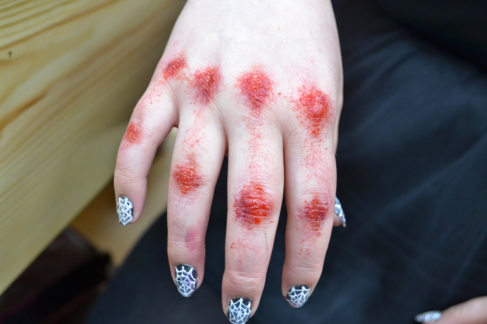
This is what the lady photographed above did on me, grazed knuckles, presumably from punching a wall. She used the same Kryolan colour wheel, GM Problood and GM Wound Filler and also applied it with different sized sponges. The wound filler is this weird jelly like substance that's a dark reddy-purple, which is pretty hard to apply, but looks really good (and by that I mean really disgusting, but life like). It mostly is there to mimic congealed blood in wounds, but also works really well as a colour to be sponged on various wounds.


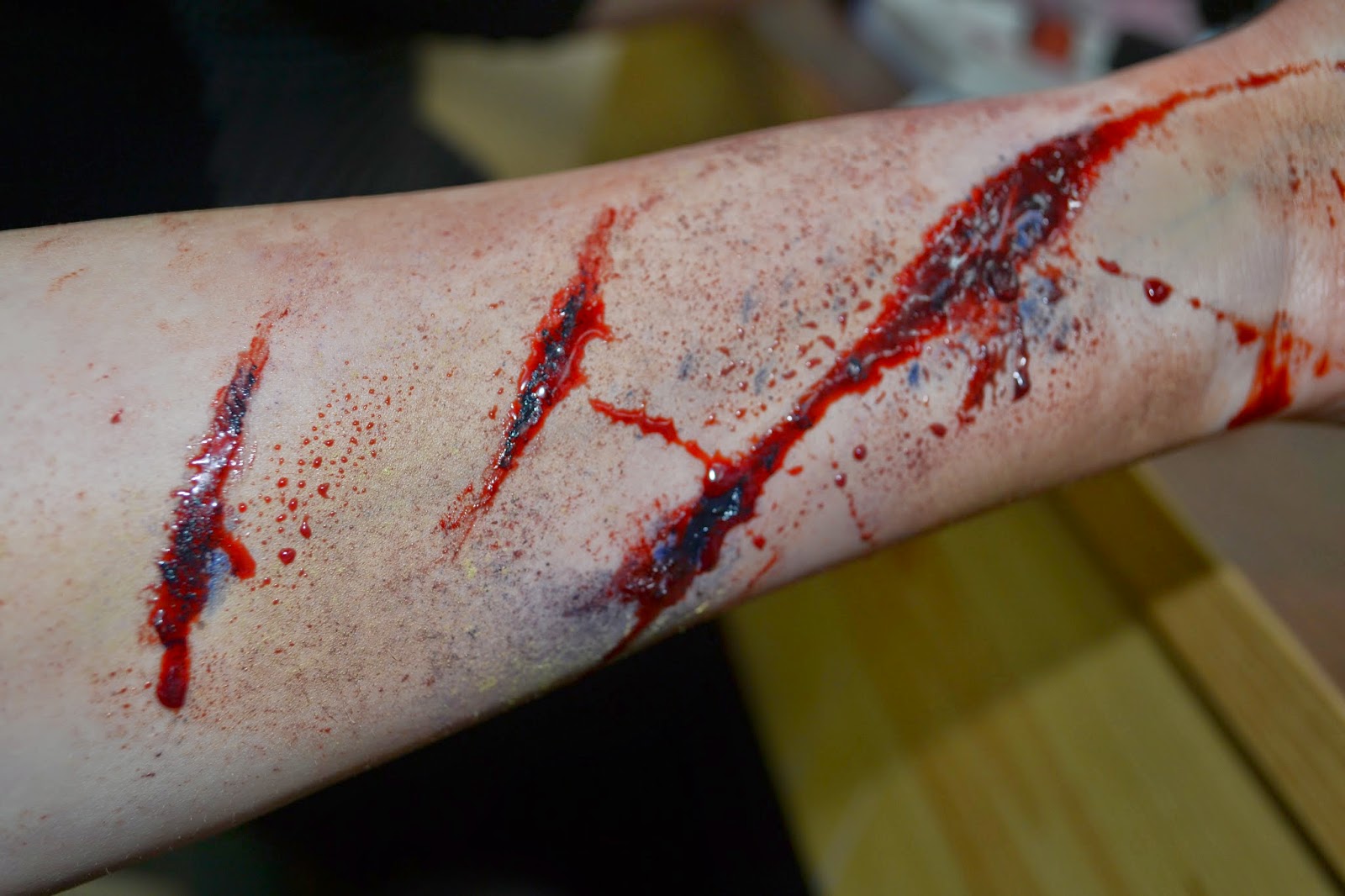
In the same session we also did cuts, where we had to use colour and tone to mimic depth in lieu of actual texture. These photographed a bit brighter than what it looked like in real life (I promise the blue didn't look that blue, it looked more black) and also, stage lights flatten colours a little, so brighter is better, so it will stand out on a stage. For this I used the same Kryolan colour wheel, fake blood and wound filler. As well as using sponges, I also used coffee stirrers (those slender wooden sticks you get in all coffee shops, weird, I know). I started by sketching out the shape of the cuts with a coffee stirrer and the dark blue from the Kryolan wheel. I then used the pale browny-yellow from the wheel to blend around the cuts, leaving a gap so there is a pale rim around them, making the cut look like it has more depth. I then piled on the wound filler, using a stick, making sure it looks like it's in the middle of a wound. Then I went back to the dark blue, with the stick, and applied the colour in the centre to add depth. I then poured in the fake blood, letting it naturally run down my arm, I then used a large-holed sponge to spread the blood about, making it real messy and gross.


In session three we started playing with gelatin, and boy is it fun. I used the vegetarian kind (being that I'm trying to cut down on meat, I felt this should count), and this was actually a good choice because it had a thicker texture, meaning that I could do some different things. The normal gelatin had a thinner texture and took longer to dry (which I observed from the other people using it). It did create a cool, crinkly texture that the vegetarian stuff didn't, though. You start with about four or five spoonfuls of boiling water to one spoonful of gelatin. You stir until it's nice and thick. I then just applied the gelatin to my hand using a plastic spoon and my fingers. I did a thin layer all over the back of the hand and fingers and then created thicker layers on the knuckles and where I wanted the cut to be. I then used the other end of the spoon to create the grooves, going right down to my skin. I then blasted a hair dryer at my hand for quite a while to dry it. I then used the dark blue from the Kryolan wheel to add darkness to the bottom of the grooves and also in the existing cracks of my fingers. I then globbed in the wound filler and then dribbled in some fake blood, letting it sink below the gelatin and seep into the surrounding area. I then used the Kryolan wheel to add extra detail to the surrounding areas and my fingers. I then applied some glycerine with a cotton bud to some areas to make it look like the skin is seeping delicious, delicious pus.


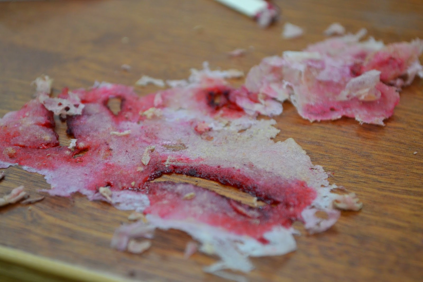
Here's a little added something, a photo of what the gelatin looked like after I peeled it off my hand. Pretty gross.


Another technique we were told was to add breakfast cereal to the gelatin for texture, as if you can eat something, it's not likely to irritate the skin. For this rash, I mixed crushed rice crispies into the gelatin. I just spread a thin layer over my arm, the cereal providing the the gross globules and the gelatin making the skin looked cracked and as if it's peeling. I then used a sponge, the colour wheel and wound filler for the colour.


I then used thin layers of the gelatin, building them up and drying them to create these blisters. Again using the colour wheel to add depth.


For this burn (?), I just wanted to experiment what a really thick layer of gelatin would look like. I think this turned out pretty cool. I'm also not sure if the redness on my arm is make up or my skin reacting to the heat of the hair dryer - worked though.

 Photo taken by Ellie Kurttz for the National Theatre, Youth Programme

The last week we were told to do a large character-esque project, as they had arranged for a professional photographer to photograph our work for portfolios. They also had a set up, so that we could see what our work looked like under stage lighting, and also on camera, as they had a live feed from a camera being projected on a wall. This is what was done on my face by a lovely Estonian woman (who I did my piece on). I'll do a separate post on what my final project was. As a side note, how pensive do I look here, I'm deep, man, so deep.

 Photo taken by Ellie Kurttz for the National Theatre, Youth Programme

Here's said woman drying the gelatin on my face.

 Photo taken by Ellie Kurttz for the National Theatre, Youth Programme

And us and Helen, with another perfect promo shot, look at how much fun we look like we're having (we were having lots of fun).

Look out for the post on my final project, I'll write it at some point, depending on how much reading I have to do for Uni.

Friday, 9 January 2015

Women From Shakespeare - A Series Of Make Up Looks Stemming From Procrastination

So, I decided to do a series of make up looks inspired by the women in Shakespeare's plays (and possibly poetry depending on what I feel like - dark lady make up, anyone?). This originated from me trying to plan a Shakespeare essay whilst having a shower, ending up in me thinking that wouldn't it be a great idea if I did Shakespeare themed make up. That essay did get written (never mind that it was finished at 7 in the morning), and some make up looks were done.

The obvious start for me was Ophelia. Hamlet is the Shakespeare play, others may be incredibly famous, but Hamlet is the big one. Also Millais painted her that one time (I'm partial to Pre-Raphaelite art). So, Ophelia's a bit of a big deal. The painting is of her death, drowned in a river, surrounded by flowers. I decided that this was what I wanted to portray, because you can't do Shakespeare without being a little morbid (Titus Andronicus, anyone?).

Starting with the skin, you want to make it pale and corpse-like, being that we are doing the make up of a dead character. I started with Stargazer's White Foundation, mixing it with a little of my normal foundation. The consistency of this foundation isn't the best, so use something like a stippling brush to apply it (or other things good at blending, such as a sponge). Then use a medium brown eye shadow (or a contour powder) to further deepen the depths of your faces - below the cheekbones, under the chin, under the lower lip, the sides of the nose, the temples, under the eyes and the corners of your mouth. No blush is needed, for obvious reasons. I did my brows quite full, for a youthful effect.
For the eyes I wanted to emphasize the size and shape, much like the eyes painted by Millais. I started by priming my eyes with Two Faced Shadow Insurance. I then took a small angled brush and a medium brown eyeshadow - Cork by Mac - drawing a line just above my crease, following the line into the nose to make the eyes appear a little larger and flicking out at the other end. I darkened this line with a darker brown - 329 by Inglot - and then blended the line a little with a clean blending brush. I used this same shadow under the eye, winging the line out under the tear duct, again making the eye appear larger. I then used Nyx Jumbo Eye Pencil in Milk all over the lid, the inner corner and the waterline, blending out with my finger. On the lid I used Honeycomb from Sleek's Au Naturel palette and I used Nougat from the same palette in the inner corner. I then used a Bourjois liquid liner to do a fine line on the upper lid with a small flick. Next, apply mascara, making sure it is quite defined and doll like for the lower lashes. I then applied eylure lashes - I can't remember which, but something with volume that gets longer in the outer corners.
 To finish, apply a clear gloss all over the lid to give that just drowned feel. I used a bourjois gloss. I would heap quite a lot of product on the back of my hand and apply it with my finger. Make sure you do this last, because you will not be able to change anything after you've done this. It also feels gross and creases like a bitch, so skip this step if you don't want to deal with that. I then loaded some mascara on my lower lid, dipped a cotton bud in water, and pressed the wet cotton bud onto the globbed mascara to simulate tears. Gently pat away the water droplet as it hits the bottom of your cheek, so the tear looks a little nicer.
For the lips, purse them, so no product will reach the creases, and pat the white foundation over them, so they look all cracked and unpleasant. Then take a pale blue eye shadow, purse your lips again, and pat the colour in the centre of the lips, so you look like you've suffocated to death. I then got more lip gloss and used a small brush to simulate water flowing out of a mouth.

And the make up is done. To complete, wet your hair and carry around a selection of flowers. This could be a great Halloween costume for you, if, like me, all your friends are literature nerds.
Finis.

Sunday, 2 November 2014

The Wonder of Sugar Skulls - A Totally Late, Somewhat Irrelevant Make Up Look

A couple of years ago I discovered the wonders of the sugar skulls. These amazing full face make up looks with a simple base look - that of a skull - and various designs and embellishments. All you need to do is google the term 'sugar skull make up' to get a plethora of incredible looks. Needless to say I was instantly inspired. So now, every Halloween - or Día de Muertos - I paint my face like a bright, beautiful skull.

This Blue Skull was the first I ever did. Blue is one of my favourite colours, and seemed suitably dark for a skull, so I chose to use it as my main theme. I started very simply, with only a little sparkle, and a very simple forehead design. This look was heavily inspired by the first google image I saw. I've branched out a little since then.

I believe I did this look a week after the Blue Skull. This incredibly creatively named Red Skull was my first try at branching out a little. I chose a different main colour and decided the design of hearts would give a cool effect. I promise you the little red sparkles surrounding my eyes were supposed to be hearts. Rather than having the petals surrounding the deep pits posing as my eyes, I decided to blend out the black with the red, creating an all around softer (more romantic?) look.

I did this look a year ago and am rather fond of it. Halloween is irrevocably tied up with Autumn and I felt that would be a rather lovely theme for a Sugar Skull. Autumn in a picture for me would be a golden leaved tree, so I used this in my look. Rather than the traditional petals surrounding the eyes, I decided to use Autumn leaves. And then I couldn't resist but to add some rhinestones, because, well, I really love rhinestones. The rest of this look is rather minimalist, which I feel works well (I could have been lazy, however).

And lastly we have the Jewelled Skull that I currently have on my face. I just wanted something utterly opulent. In the past I've done skulls with fairly natural themes, this year I wanted something utterly artificial. I also felt like playing around with doing full fledged teeth, rather than the simpler plain lines that look like stitches. For the actual skull features, I put in a little more effort, actually following the look of a skull, with the more prominent cheekbones and deeper temples. And more rhinestones, of course.
 As a little touch of advice for doing a look like this, an eye-liner pen is a massive help. I generally dislike eye-liner pens, they tend to be more grey than black, I can never get the sharp point I want, they dry out so quickly and in my experience, they really don't hug the lash line (I've tried three different brands and been heavily disappointed with all of them). Regardless, they're really great for this kind of look. You don't need too precise lines, but you want something a little more precise than a pencil (I realise a pencil can be precise, but it's a massive friggen pain). I've found liquid liner and gel liner a bit awkward too. Pen liners just make it so easy. I use the pen to sketch out the lines, I then fill it in with a pencil liner (typically a Nyx Jumbo Eye Pencil, I use Black Bean), I then set this with a black eye shadow. Parfait.